Graphic design is the visual language of communication that involves images, symbols, text, and other elements to convey ideas, stories and messages in various forms. As a new entrepreneur or designer, you might think design is all about being creative. But just picking random typefaces and colours can lead to a messy or unattractive design. That's where the principles of graphic design come in—they're important rules that help you create designs that look good and work well.
Let’s try to understand the 5 basic principles of graphic design and why they are important:
- Balance:
This involves attaining visual stability by distributing elements such as texts, shapes, and images evenly throughout the design.
There are three forms of balance:
- Symmetrical – Symmetrical design is distributing the elements’ weight equally on both sides of the layout.
- Asymmetrical – This balance style uses size, contrast, and colour to create a smooth layout flow. It’s commonly seen on websites, where two sides of a webpage are different but share similar elements.
- Radial – In this type of layout, elements are arranged in a circular pattern, creating a feeling of motion and energy for the viewer’s eyes.
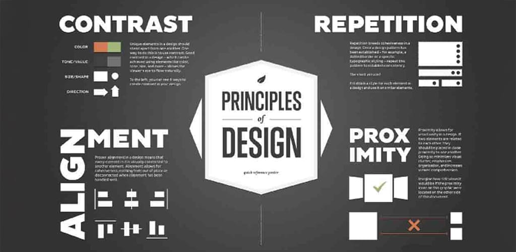
2. Alignment:
Alignment is a crucial element of design, creating visual connections between images, shapes, and text blocks. Alignment enhances the design’s crisp and organized look by removing any distortions within the layout.
3.Hierarchy:
The principle of hierarchy in graphic design refers to the arrangement of elements within a composition to establish a visual order of importance through the design by prioritizing certain elements over others.
Some common ways are:
- Using Larger elements and contrasting colours to differentiate between elements.
- Positioning important elements higher on the page.
- Utilizing whitespace around important elements.
- Using different fonts, weights, and styles to emphasize certain elements
4.Contrast:
The contrast principle in graphic design involves the strategic use of differences in elements such as colour, size, shape, texture, or style to highlight important information.
It can be applied in ways like –
big/small size,
classic/contemporary fonts,
thin/thick lines,
cool/warm colours,
dark/light,
smooth/rough textures,
horizontal/vertical.
5.Rhythm:
Rhythm entails creating visual flow by repeating specific elements like shapes, patterns, logos, lines or colours to enhance brand recognition and improve the overall aesthetic appeal.
It can be classified in 2 types:
- Fluid – Fluid rhythm in design means there’s a lot of change happening, but it still flows smoothly in one direction.
- Progressive – Progressive rhythm is based on a clear sequence which controls the visual movement of the audience between the different elements. rephrase this in simple language.
Graphic design isn’t as simple as it may seem. If you’re someone unfamiliar with design and creativity isn’t your forte and you need assistance, Acture Media, your graphic design best friend, has got your back. Hit us up, so we can discuss more about your design needs and be creative together.